We start by analyzing your business goals, user behavior, and device usage trends. Our strategy ensures your website structure is optimized for seamless performance across all screen sizes and future scalability.
Start Your ProjectWe design intuitive, visually engaging interfaces that adapt beautifully across devices. Every layout is crafted with usability, accessibility, and conversion-focused design principles.
Design ExperienceWe build flexible, fast-loading websites using modern frameworks and clean code. Your website will adapt perfectly across desktops, tablets, and mobile devices without compromising performance.
Develop WebsiteWith mobile traffic dominating the web, we prioritize mobile-first design. We ensure fast navigation, touch-friendly layouts, and optimized content for smaller screens.
Optimize for MobileWe optimize every element for speed, stability, and security. From image optimization to caching and clean coding practices, your website delivers a fast and smooth experience.
Boost PerformanceWe structure your website to rank better in search engines and convert visitors into customers. From Core Web Vitals to responsive SEO, we help your business grow online.
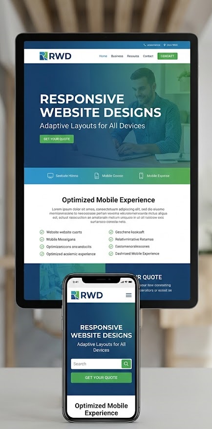
Grow Your WebsiteWe design and develop responsive websites that deliver seamless user experiences on mobile, tablet, and desktop. Our solutions focus on speed, usability, and conversions to help your business grow in a multi-device world.
We build tailored responsive websites designed specifically for your business, ensuring flexibility, scalability, and a consistent experience across all devices.
Our websites are optimized for speed with clean code, compressed assets, and modern techniques to ensure fast load times and better Core Web Vitals.
We follow best practices for responsive SEO, ensuring proper structure, fast performance, and mobile-friendly indexing to improve your search rankings.
We prioritize mobile users by designing experiences that are intuitive, fast, and easy to navigate on smaller screens before scaling up.
We implement best practices for website stability and security, ensuring your site performs reliably across devices and environments.
Our responsive designs are built to evolve with new devices, screen sizes, and technologies, keeping your website relevant long-term.
Responsive web design ensures your website automatically adapts to different screen sizes and devices. It provides a consistent user experience across mobiles, tablets, and desktops while improving usability, performance, and accessibility.
We follow a structured workflow focused on usability, performance, and scalability. Each stage ensures your website delivers a seamless experience across all devices.
With users accessing websites from multiple devices, responsive design is essential for delivering a consistent and engaging experience while improving SEO and conversions.
Our strategy focuses on creating flexible, scalable, and performance-driven websites that adapt to evolving devices and user expectations.
A well-optimized responsive website becomes a powerful growth tool, improving engagement, increasing traffic, and driving higher conversions.
Responsive web design ensures your website automatically adapts to different screen sizes and devices, providing a seamless experience across mobile, tablet, and desktop.
With most users browsing on mobile devices, responsive design improves user experience, reduces bounce rates, and helps your website rank better in search engines.
Our services include UI/UX design, mobile-first layouts, responsive development, speed optimization, SEO setup, and cross-device testing.
Yes, we design websites that work seamlessly across all screen sizes, including smartphones, tablets, laptops, and large desktop screens.
Most responsive websites take 1 - 3 weeks depending on complexity. Larger projects with advanced features may require additional time.
Yes, we can upgrade your current website to a fully responsive design, improving its performance, usability, and mobile experience.
Absolutely. Responsive websites help small businesses reach more users, improve engagement, and compete effectively in the digital space.
Yes, search engines prioritize mobile-friendly websites. Responsive design improves page speed, usability, and indexing, which positively impacts SEO rankings.
Mobile-first design means designing for smaller screens first, then scaling up for larger devices. This ensures better performance and usability on mobile devices.
Yes, we optimize images, code, and performance to ensure fast loading speeds across all devices, especially on mobile networks.
Yes, we enhance existing websites by optimizing speed, improving responsiveness, fixing layout issues, and upgrading overall performance.
Yes, we offer maintenance and support services to keep your website updated, secure, and performing optimally.
We implement best practices for stability and security, including HTTPS, performance monitoring, and regular updates to ensure your site remains safe.
Yes, we build user-friendly websites or integrate CMS solutions that allow you to easily update content without technical expertise.
Yes, our responsive websites are built with scalability in mind, allowing you to expand features, pages, and integrations as needed.
We deliver high-performance, mobile-first websites focused on user experience, speed, SEO, and conversions - helping your business grow across all devices.
Leverage data-driven strategies, creative storytelling, and performance campaigns to accelerate brand growth at scale.
Quikseo builds scalable search acquisition systems that generate qualified demand, reduce paid dependency, and drive predictable growth.
 info@quikseo.in
 B10, Mohan Cooperative Industrial Estate
72 Hollow Croft, Knowsley
B10, Mohan Cooperative Industrial Estate
72 Hollow Croft, Knowsley
 +91 9716120959
Copyright 2026 Quikseo. All rights reserved