Businesses today must provide seamless browsing experiences across smartphones, tablets, laptops, and desktops. As mobile internet usage continues growing, companies often face an important decision: should they build a separate mobile website or use responsive web design? Understanding the differences between these approaches helps businesses choose the best solution for user experience, SEO, maintenance, and long-term scalability.
What Is a Separate Mobile Website?
A separate mobile website is an independent version of a website specifically designed for mobile devices. These websites often use a different URL structure such as m.example.com and provide mobile-optimized layouts separately from the desktop website.
Mobile Design Insight
Separate mobile websites were more common before responsive web design became the industry standard.
What Is Responsive Web Design?
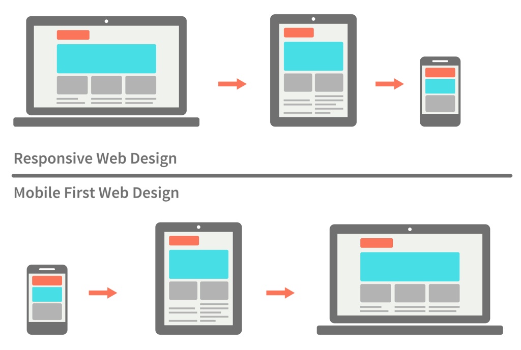
Responsive web design uses flexible layouts, media queries, and adaptive content structures that automatically adjust to different screen sizes. Instead of creating separate websites, responsive design uses a single website that works smoothly across all devices.
Single Website Structure
One website automatically adapts to different screen sizes.
Simplified Development
Developers manage a single codebase for all devices.
SEO-Friendly Design
Responsive websites improve search engine optimization performance.
Better User Experience
Users enjoy consistent browsing across all devices.
Difference 1: Website Development Process
Separate mobile websites require businesses to build and manage two different website versions, while responsive design focuses on a single adaptable website structure. Responsive development is generally faster, simpler, and easier to maintain long-term.
- Easier Single-Site Management
- Faster Website Updates
- Lower Development Complexity
- Simplified Content Publishing
- Reduced Maintenance Work
- Better Scalability for Future Growth
Responsive design helps businesses manage websites more efficiently while delivering consistent user experiences.
Difference 2: User Experience Across Devices
Responsive websites provide a consistent experience regardless of device type, while separate mobile websites may create inconsistencies between desktop and mobile versions. Consistent navigation, branding, and layouts improve customer trust and usability.
Responsive Design Advantages
- Consistent user experience
- Unified branding across devices
- Smooth device adaptability
- Better navigation consistency
Separate Mobile Website Challenges
- Different content experiences
- Inconsistent layouts
- Duplicate management work
- Complex maintenance process
Difference 3: SEO & Search Visibility
Responsive web design is highly recommended for SEO because it uses a single URL structure and simplifies search engine indexing. Separate mobile websites may create duplicate content issues and additional SEO management challenges if not handled properly.
Improved Search Rankings
Responsive websites support stronger SEO performance.
Single URL Structure
One URL simplifies indexing and link sharing.
Better Content Consistency
Search engines easily understand unified website content.
Higher Organic Traffic Potential
SEO-friendly design improves online visibility.
Difference 4: Website Maintenance & Costs
Maintaining separate desktop and mobile websites requires additional development, testing, and content management efforts. Responsive design reduces long-term maintenance costs because businesses manage only one website version.
Business Tip
Responsive web design often provides better long-term value because it reduces maintenance complexity and development costs.
Difference 5: Website Performance & Speed
Both approaches can achieve strong website performance when properly optimized. However, responsive websites built with modern optimization practices often provide excellent loading speed while maintaining design consistency across devices.
Responsive Website Benefits
- Unified optimization strategy
- Consistent loading experience
- Modern responsive frameworks
- Efficient website management
Separate Mobile Site Limitations
- Duplicate optimization work
- Separate performance monitoring
- Higher maintenance overhead
- Additional development complexity
Which Option Is Better for Modern Businesses?
For most businesses, responsive web design is the preferred solution because it improves SEO, simplifies maintenance, reduces costs, and provides consistent user experiences. Separate mobile websites may still be useful in highly specialized situations, but responsive design has become the modern industry standard for scalable website development.
Future Trends in Responsive Web Design
Responsive web development continues evolving with AI-powered layouts, progressive web apps, faster mobile optimization, accessibility-focused design, and performance-driven frameworks. Businesses adopting modern responsive technologies often achieve stronger user engagement and better online visibility.
How Responsive Design Supports Business Growth
Responsive web design improves customer experience, supports SEO growth, increases accessibility, and helps businesses reach users across all devices efficiently. A professionally designed responsive website creates stronger digital presence and supports long-term online business success.
Need a Modern Responsive Website for Your Business?
Quikseo creates responsive, SEO-friendly, and high-performance websites designed to improve user experience and business growth across all devices.
Get Free Website Consultation